I just found this really great site:
http://www.ssa.gov/OACT/babynames/ . It gives long-term statistics on the popularity of baby names in America – wow!
Upon finding it, I did what any ½-way thinking person would do: I compared “William” to “George” over the last 35 years. (The reason for 35 years was to get a “baseline” for each name, before getting to the “interesting” last 10-15 years.)
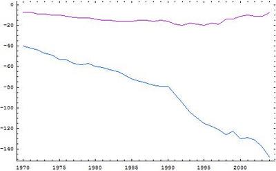
Without further ado, here are the results in graph form:

Ignore the negative signs on the vertical axis – the numbers themselves refer to the popularity ranking of each name in a given year (so higher is more popular). Red is the Big Dawg, while Blue is, well, you can guess…
The graph is pretty clear, but here’s the upshot: Bill had a slight dip in popularity in the 90s, but has since more than made up for the drop.
George, on the other hand, didn’t fare so well – even in relative terms. George started going downhill steeply towards the end of Poppy’s term, but then had a slight recovery around the time GW got into office. But alas, the recovery was a la The Battle of the Bulge, soon to be swamped by an even more precipitous drop.
End result: practically no-one has the gumption to name their kid “George”, while “William” is more popular than ever. Kind of like real life, I guess. Huh – looky that.


